Overview
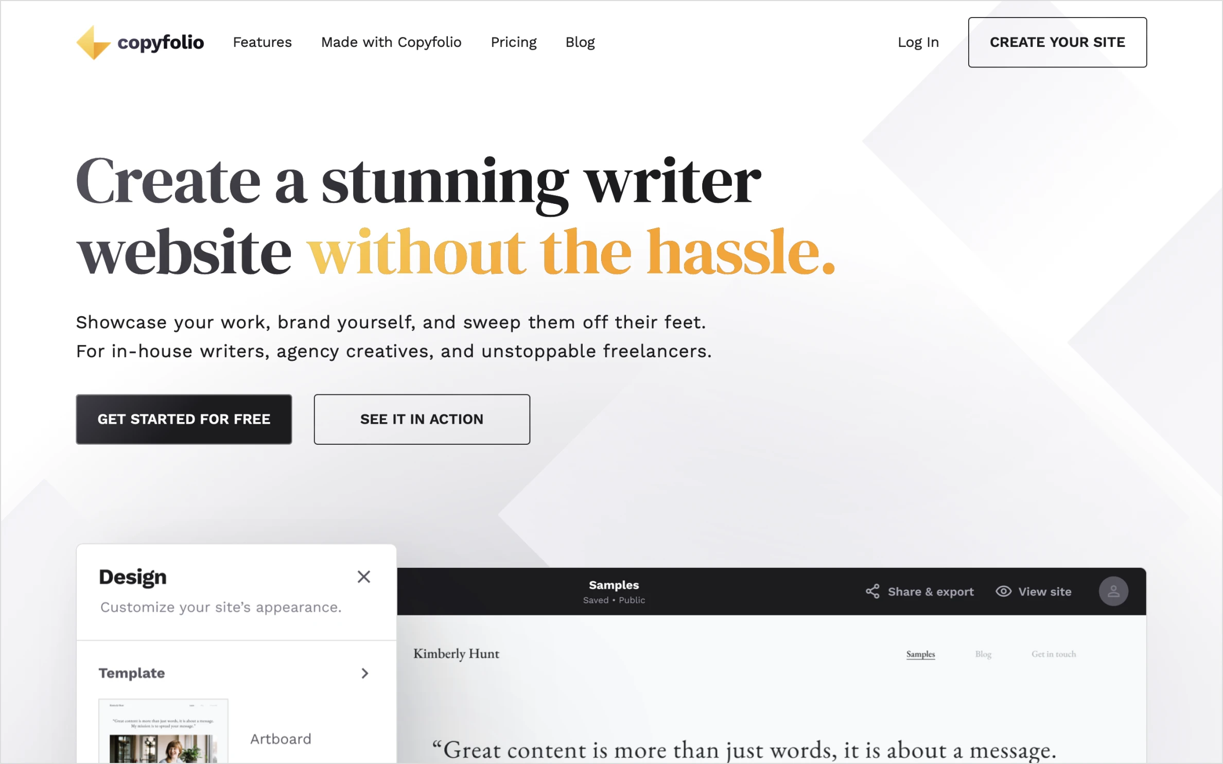
This project focuses on designing a website for three apartments located on the Adriatic Sea. The goal is to educate visitors about why they should visit Pašman Island and why Apartments Mirjana is the best accommodation choice.
Designer: Patricija Franković
Responsibilities: Research, Branding, UX/UI Design, SEO, Marketing Strategy
Tools Used: Figma, Trello, Google Keyword tool, Semrush, ChatGPT, Google lighthouse, Screamingfrog
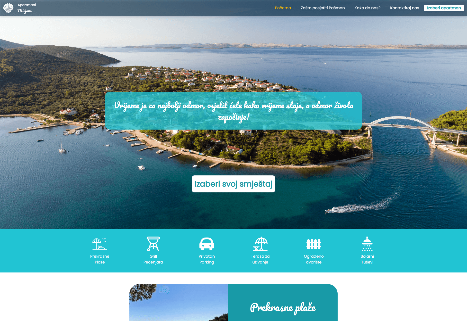
Process:
✨Researching
I conducted thorough market research to understand local industry standards. By analyzing competitors and benchmarks on Pašman island, I identified key opportunities to differentiate the brand.
✨UX&UI design
I translated research insights into a strategic design plan. This phase focused on creating an intuitive user flow and visual identity specifically structured to achieve business KPIs and drive bookings.
✨SEO & Copywriting
This was the most crucial phase for organic growth. I executed a content-first strategy: setting up SEO campaigns and writing compelling, keyword-rich copy that resonates with potential guests and ranks well on Google.
✨Development handover
Marketing doesn't end at launch. Beyond preparing pixel-perfect assets for developers, I established an analytics framework to measure performance and ensure the final product delivers on its conversion goals.
01 — Project Background
Challenge
Apartments Mirjana specializes in family-friendly and young adult vacation rentals. Previously, the business relied on a popular online booking platform as its primary advertising channel. However, recent policy changes on that platform have made it increasingly difficult to continue advertising.
Solution
To overcome this challenge, the business owner decided to create a standalone website as the primary marketing and booking tool.
The project’s objectives include:
✅ Developing a modern, user-friendly website to showcase available apartments and amenities.
✅ Enhancing user experience (UX/UI) with seamless navigation and relevant information.
✅ Establishing a strong brand identity consistent across all marketing channels.
✅ Collaborating with developers to ensure smooth execution and timely delivery.
01 — Project details
Our aim was to improve the conversion of the client’s landing page by completely reworking the copy. We couldn't change the design which set strict limitations regarding character count.
Persona 1: Marija Tadić
🧑⚕ Age: 45 | Occupation: Pharmacist | Location: Croatia
📢 "As a mother of two, I want an affordable, spacious apartment with great amenities so I can relax and have fun without going far."
Goals:
✔ Find a vacation rental that accommodates a family of four.
✔ Have easy access to attractions and activities.
✔ Enjoy a stress-free, relaxing vacation.
Challenges:
❌ Finding an apartment within budget that meets the family’s needs.
❌ Ensuring a safe and secure location.
❌ Balancing the family's interests while meeting personal preferences.
❌ Coordinating travel logistics with work and family schedules.
Motivation:
✨ Spending quality time and creating memories.
✨ Having a comfortable and convenient stay.
✨ Exploring new places and cultures.
✨ Unwinding from daily life stresses.
Persona 2: Mateo Petek
🚴 Age: 26 | Occupation: Personal Assistant | Location: Slovenia
📢 "As a passionate biker, I want an apartment where I can bring my bike and travel around easily."
Goals:
✔ Find a romantic, private getaway.
✔ Have easy access to outdoor activities like beaches and hiking.
✔ Experience local Croatian culture and cuisine.
Challenges:
❌ Finding a budget-friendly yet romantic apartment.
❌ Ensuring secure car parking.
❌ Locating apartments with bike storage.
❌ Managing travel expenses while maximizing experiences.
Motivation:
✨ Spending quality time and creating romantic moments.
✨ Exploring Croatia’s outdoor beauty.
✨ Immersing in local traditions and food.
03 — Competitive Research
I conducted a thorough analysis of competing private apartment rentals. The key findings revealed that many competitors:
❌ Offered similar services and amenities but lacked a unique identity.
❌ Did not differentiate themselves in branding.
❌ Had outdated websites and poor user experiences.
To stand out, Apartments Mirjana needed a modern, visually appealing, and memorable brand inspired by the Mediterranean Sea.
Competitor Reviews
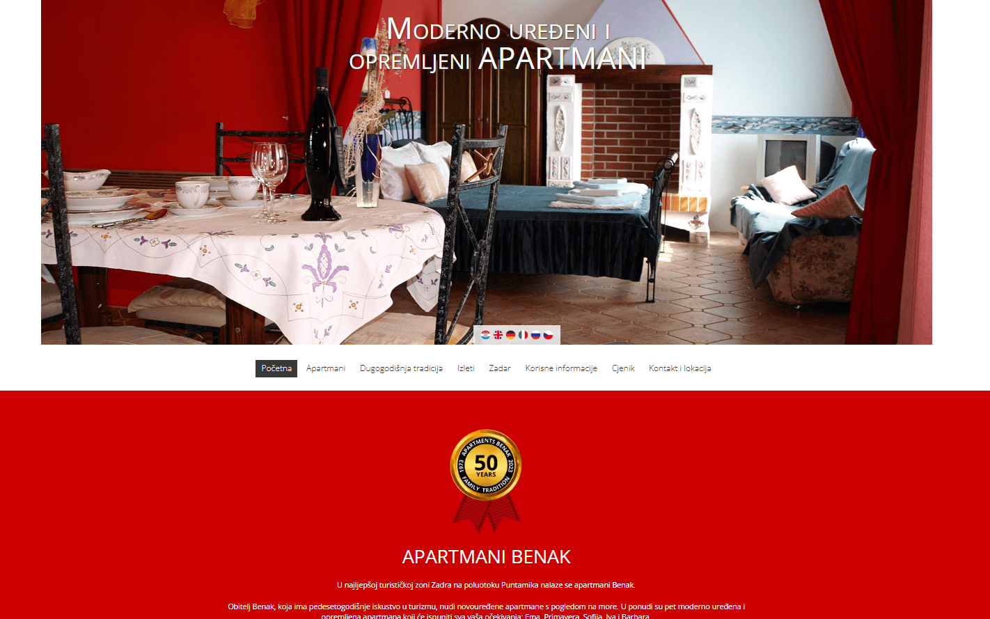
Apartmani Benak
✅ Pros:
✔ Multi-language support.
✔ Clear trip descriptions for easy planning.
✔ Contact information is easy to find.
✔ Detailed amenities list & floor plans.
❌ Cons:
Actual prices not shown.
Outdated website design.
No strong branding for a memorable experience.
Poor-quality images.
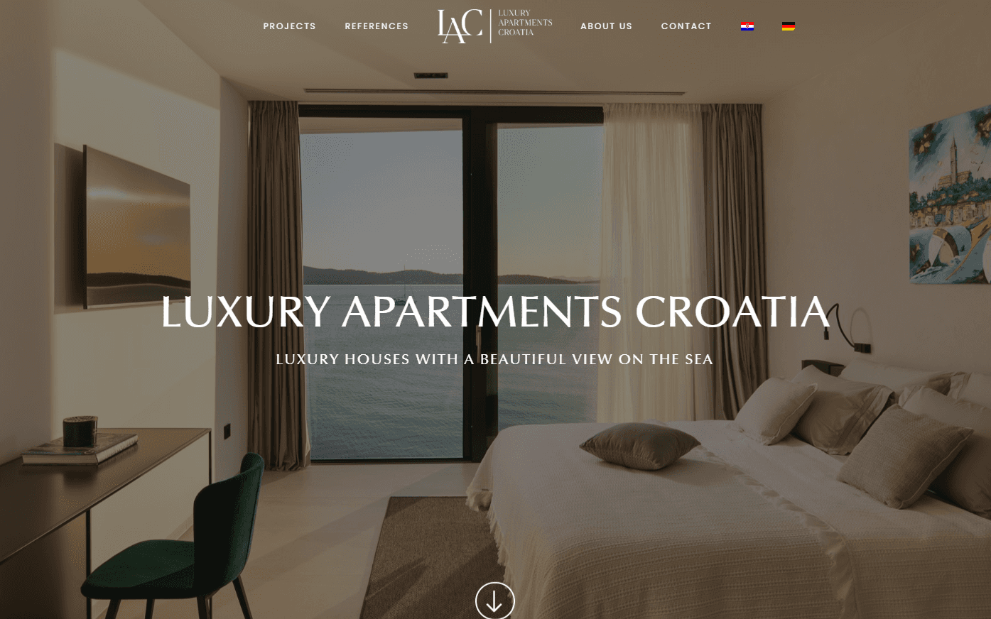
Luxury Apartments Croatia
✅ Pros:
✔ Modern design & branding.
✔ Well-organized amenities list.
✔ Apartments explained in detail.
✔ Booking calendar & location map.
✔ Transparent pricing.
❌ Cons:
The brand lacks uniqueness and memorability.
Amenities near locations are not interactive or informative.
04 - SWOT analysis
🟢 Strengths:
✔ Large, affordable apartments.
✔ Prime location near the capital.
✔ Good transportation connections.
✔ Various amenities available.
🔴 Weaknesses:
❌ Not listed on Airbnb.
❌ Low brand awareness.
❌ No previous marketing efforts.
❌ Limited budget.
🟡 Opportunities:
✔ Personalized guest experience.
✔ Strong brand positioning.
✔ Tourism growth year over year.
✔ Word-of-mouth marketing potential.
🟠 Threats:
❌ Global financial crisis impacting travel.
❌ Rising costs affecting budgets.
❌ Environmental concerns (destruction of local fauna and landscapes).
05 - Branding & Visual Identity
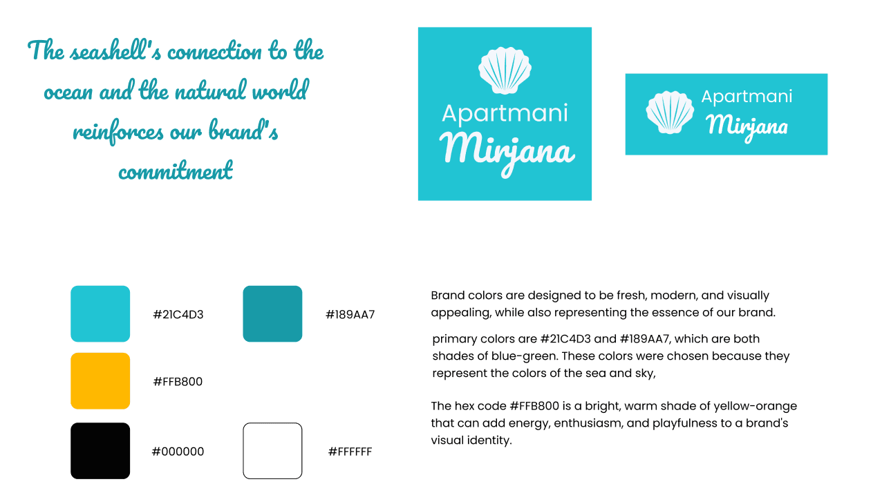
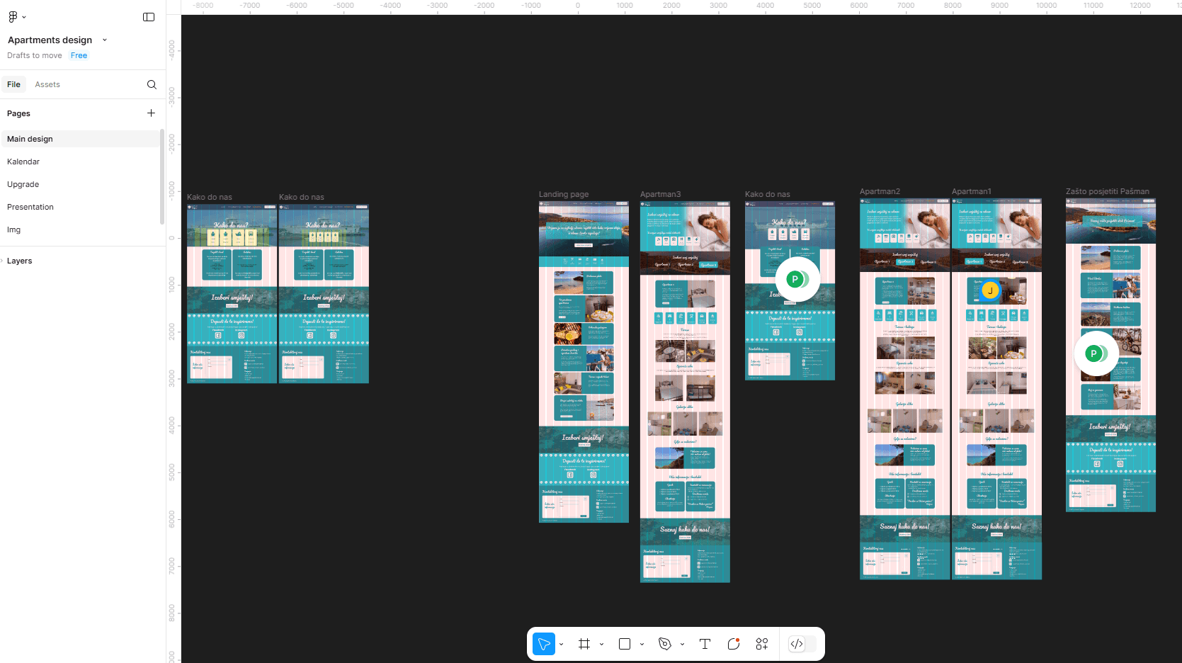
I developed a consistent identity across all platforms to establish Apartments Mirjana as a memorable brand.
Typography & Colors
Poppins → Clean, modern, and readable.
Pacifico → Adds a playful and friendly touch.
Primary Colors:
🎨 #21C4D3 – Sea blue
🎨 #189AA7 – Teal
🎨 #FFB800 – Warm yellow-orange (energy & enthusiasm)
06 - Marketing Strategy
Leveraging Word-of-Mouth for Brand Awareness
Word-of-mouth marketing is one of the most powerful tools for building brand awareness, as people are more likely to trust recommendations from friends and family over traditional advertisements. Understanding this, we designed a strategy to organically spread awareness of Apartments Mirjana by providing guests with personalized, shareable materials that would encourage them to talk about their experience.
Custom Postcards: A Unique and Shareable Experience
To encourage organic promotion, I created custom postcards featuring fun and engaging quotes about travel, relaxation, and island life. These postcards were placed inside the apartments, allowing guests to send them for free directly from their stay.
Why Postcards?
📌 Memorability – A tangible keepsake that reminds guests of their stay.
📢 Encourages Sharing – By providing a free way to send a postcard, guests naturally help spread the brand to friends and family.
🎨 Aesthetic Appeal – Designed to align with the brand’s visual identity, using coastal-inspired colors, elegant typography, and playful messaging.
💡 Subtle Promotion – Each postcard subtly includes the Apartments Mirjana branding, website, and social media handles, making it a natural yet effective marketing tool.
Business Cards: Easy Contact for Guests
In addition to postcards, we included business cards in each apartment to ensure that guests had a direct and convenient way to contact us. These business cards serve multiple purposes:
✅ Easy access to contact information – Guests could quickly reach out for assistance, questions, or bookings.
✅ Encouraging repeat stays – Guests leaving with a business card were more likely to remember and rebook.
✅ Word-of-mouth referrals – Visitors could share the card with friends or family looking for accommodations in the future.
✅ Consistent branding – The business cards matched the brand’s elegant and modern aesthetic, reinforcing a professional and trustworthy image. tool.
Digital Innovation: Postcard-Style Contact Form
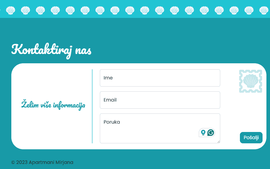
To complement our physical postcard strategy, we introduced a digital contact form on the website that mirrors the look and feel of a traditional postcard.
Why a Postcard-Inspired Contact Form?
💡 Interactive & Engaging – Instead of filling out a generic inquiry form, guests could enter their message in a beautifully designed postcard-style interface.
✉️ Emotional Connection – The familiar postcard format made sending a message feel more personal—as if they were writing to a friend rather than submitting a standard form.
🎨 Brand Consistency – This innovative feature reinforced the brand identity by integrating the same colors, typography, and playful elements used in the physical postcards.
Future upgrades
While at this point both budget and time are limited, there are features that are going to be worked on in the future. As a result, I have carefully prioritized certain features that are essential to delivering the best possible experience for guests.
Interactive list with all national parks and other interesting things to do near the location.
Digital postcards – Guests will be able to choose a fun design, personalize their message, and share their memories via email or on their social media.
Calendar that will allow the user to send an inquiry by selecting certain dates.