
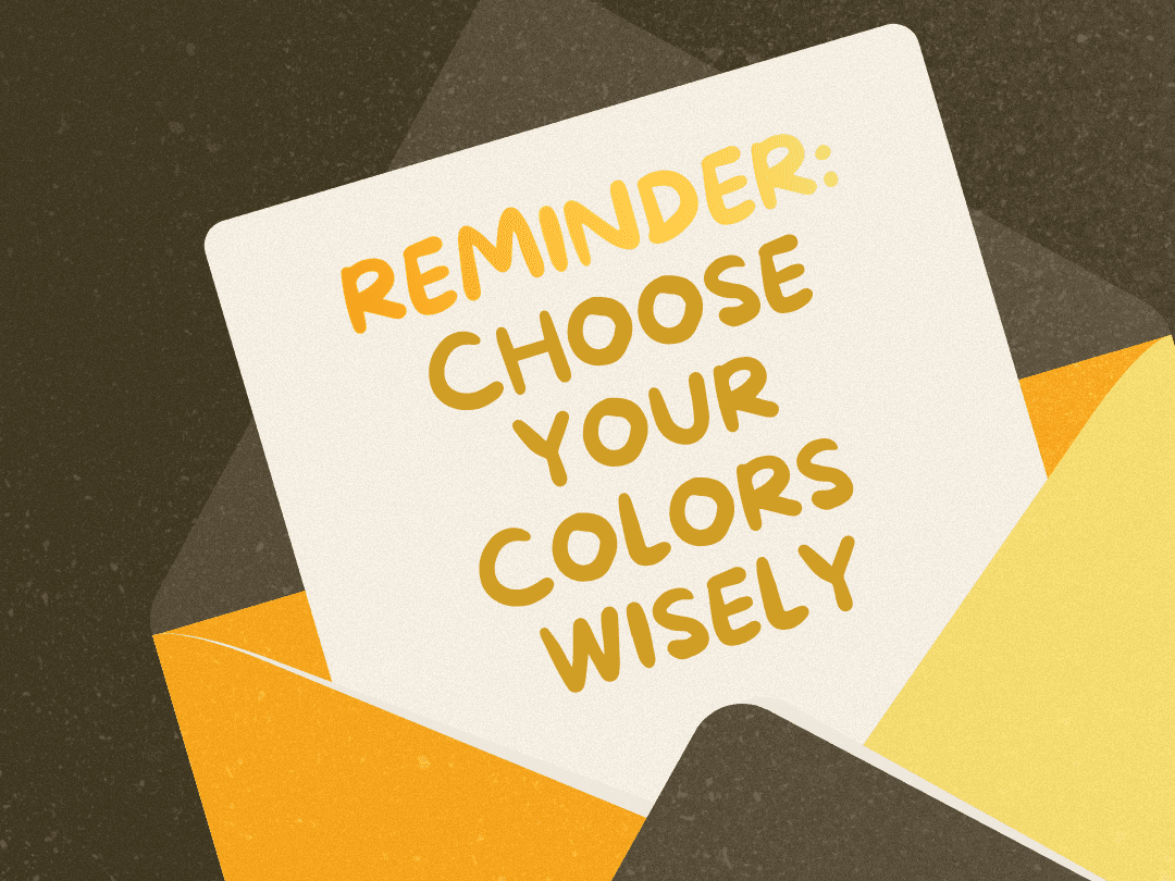
The Power of Color Psychology in Marketing Portfolios
Color isn’t just decoration—it’s one of the first things visitors notice and a subtle but powerful tool for influencing how they feel about your brand. Studies show that up to 80 % of brand recognition comes from color and that 85 % of customers cite color as a primary reason for choosing one product over another. With numbers like these, marketers can’t afford to ignore color psychology in their portfolios.
Why Color Psychology Matters
Color psychology examines how hues evoke emotions and drive consumer behavior.
Red inspires excitement and urgency, making it ideal for calls-to-action.
Blue signals trust and reliability hence its popularity among tech companies and financial brands.
Green conveys balance and growth, often associated with sustainability.
Neutral tones like beige, grey, and black represent sophistication and minimalism.
When visitors browse your portfolio, your color palette silently communicates your professionalism, creativity, and values long before they read a single word.
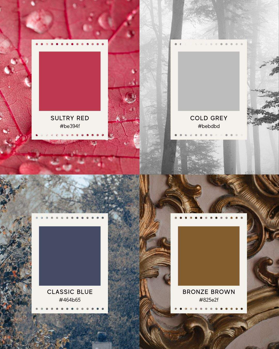
Copyfolio’s Color Palette Options
One of Copyfolio’s greatest strengths lies in its range of professional color systems and the ability to fully customize them. Whether you prefer a clean, neutral base or a vibrant, expressive aesthetic, Copyfolio offers palettes that enhance your brand story through color psychology.
Here are a few examples from Copyfolio’s design library:
Subtle Palettes
Minimal, modern options like Charcoal, Ink, or Deep Taupe convey professionalism and reliability.
Charcoal evokes focus and sophistication, perfect for corporate or tech portfolios.
Ink adds a hint of depth and authority with its cool navy undertones, ideal for strategy-driven marketers.
Deep Taupe brings warmth and approachability, balancing structure with personality.
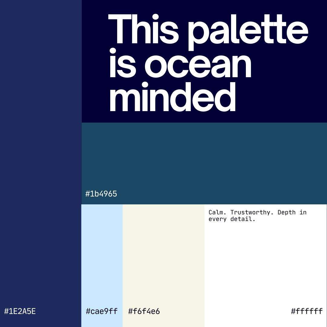
Dark Mode Palettes
Themes like Oxford or Cardamom blend contrast and comfort.
Oxford combines muted blues and creamy beige, giving a refined, academic feel.
Cardamom offers cozy neutrals that feel elegant and grounded, great for creative professionals who want subtle luxury.
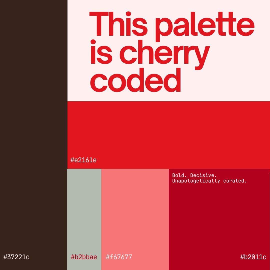
Tinted Palettes
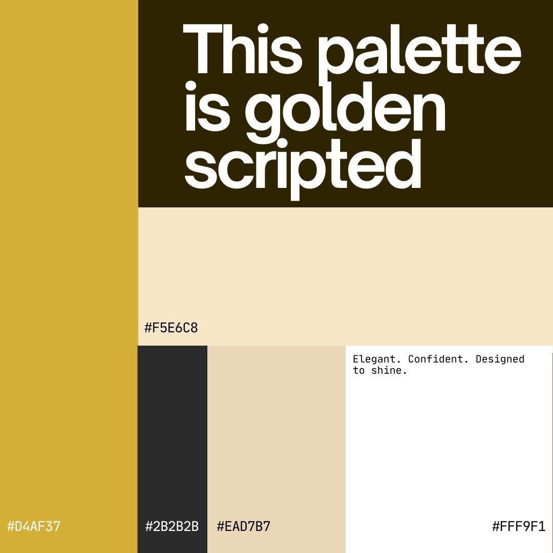
Vibrant yet balanced, palettes like Bronze Glint or Spanish Viridian express energy and creativity.
Bronze Glint merges gold and beige for a feeling of confidence and success.
Spanish Viridian uses deep greens for a refreshing, innovative look tied to growth and vitality.
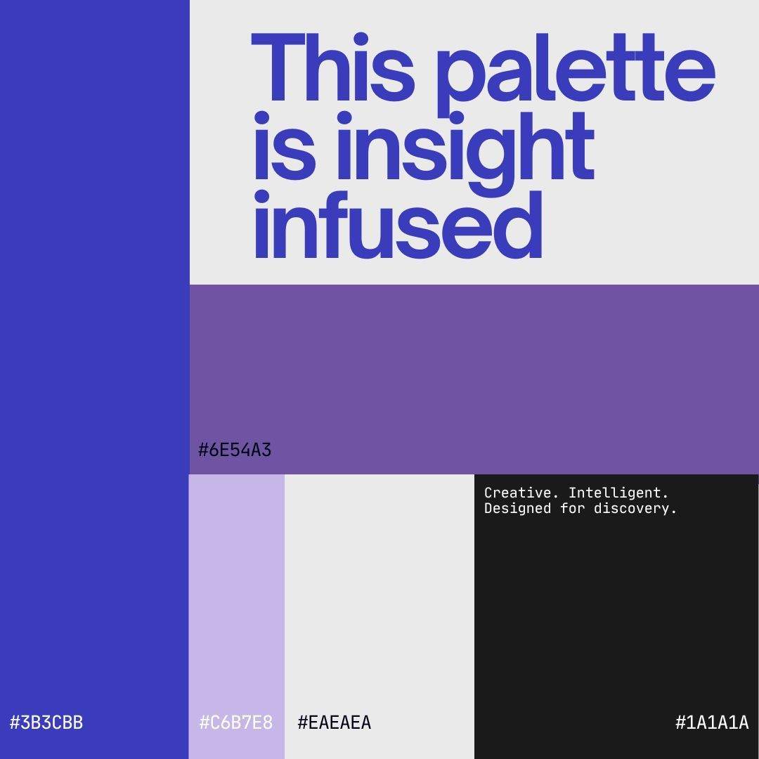
New Expressive Palettes
Recent additions like Blush, Seaside, and Hyacinth introduce playful, emotional storytelling through color.
Blush combines soft pinks and neutrals to evoke empathy and modern femininity.
Seaside uses teal and grey tones that suggest clarity and calmness.
Hyacinth, with its purple-blue gradient, channels creativity and imagination—perfect for UX and design portfolios.
What makes these palettes work is that each is built on harmonious contrasts, balancing warm and cool tones, light and dark shades to guide visual flow and maintain emotional balance.
And if none of these fit your vision? Copyfolio lets you create your own palette from scratch. You can experiment with different tones and test combinations until you find the perfect emotional match for your brand identity.
How to Harness Color Psychology
Define your brand attributes. List the traits you want your brand to embody (e.g., innovative, approachable, luxurious) and research which colors evoke those emotions.
Choose a primary and secondary palette. Use your main color for CTAs and key highlights; secondary shades can emphasize sections or data visuals. Copyfolio’s curated palettes make this effortless.
Maintain consistency. Apply your chosen palette across your homepage, case studies, and blog posts for a cohesive look—Copyfolio’s global color settings make this easy.
Test and iterate. Use A/B testing to see which color combinations lead to higher engagement or conversions.
Customize Your Own Palette with Copyfolio
What truly sets Copyfolio apart is how intuitive its color customization system is. Beyond its curated palettes, you can define your main color for instance, a fresh green like #91AD00 and Copyfolio automatically generates complementary tones for your site. It intelligently suggests how your headings, paragraphs, buttons, and backgrounds should look based on your chosen hue, ensuring visual harmony across every page.
You can toggle between two intelligent modes:
Matching colors, which create a cohesive, monochromatic look ideal for minimalist portfolios and professional brands.
Opposing colors introduce dynamic contrast which is perfect for portfolios that want to stand out with more visual energy and personality.
This smart system lets you experiment freely while maintaining design consistency, even if you don’t have a background in color theory. It’s a practical way to apply color psychology in action, balancing emotion, readability, and brand recognition without overcomplicating your design.
By intentionally selecting colors based on psychological principles, you can build a portfolio that resonates emotionally and keeps viewers engaged. Copyfolio’s flexible templates and color settings give you everything you need to put these insights into practice plus, you can save 20 % on your subscription with code FRANKOVIC20.
Understanding colour psychology is just one part of building a personal brand. To see how your palette fits into a broader brand identity, read my guide on creating a cohesive personal brand. Once you've chosen your colours, the Copyfolio brand‑character tool can help you define your tone and USP so that your visuals and voice work together. For a practical example, my post on adding videos to your portfolio shows how colour and motion combine to build trust.